A Tired Person's Bloghi please leave
|
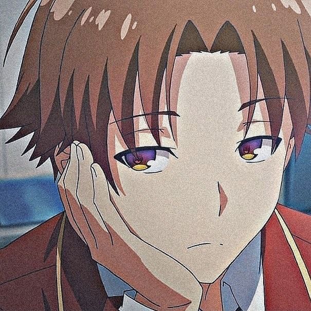
I'm just going to place this sociopath here out of context :)
|
|
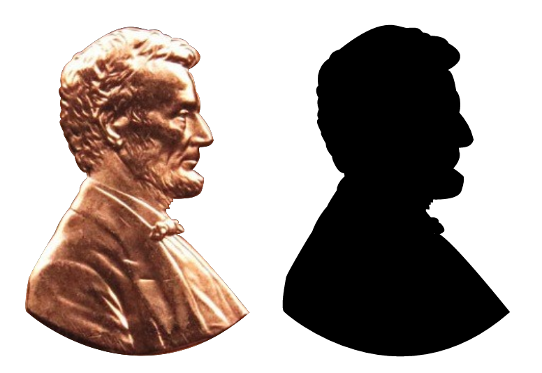
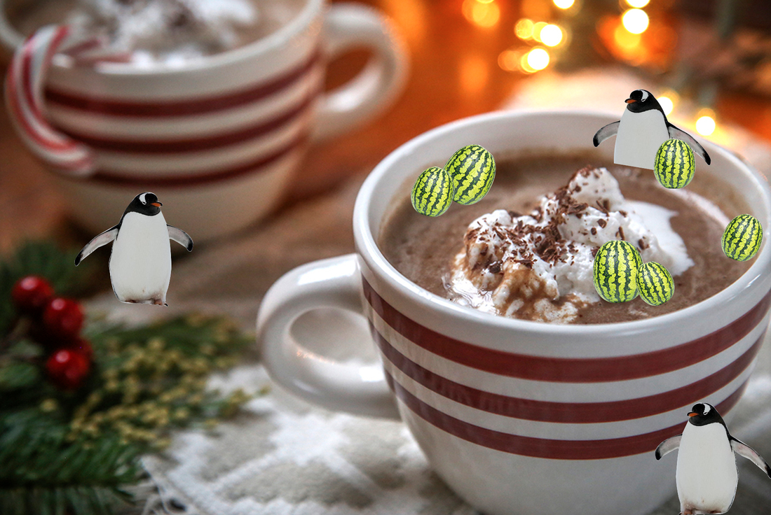
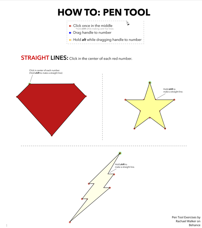
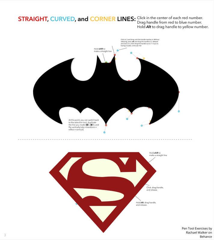
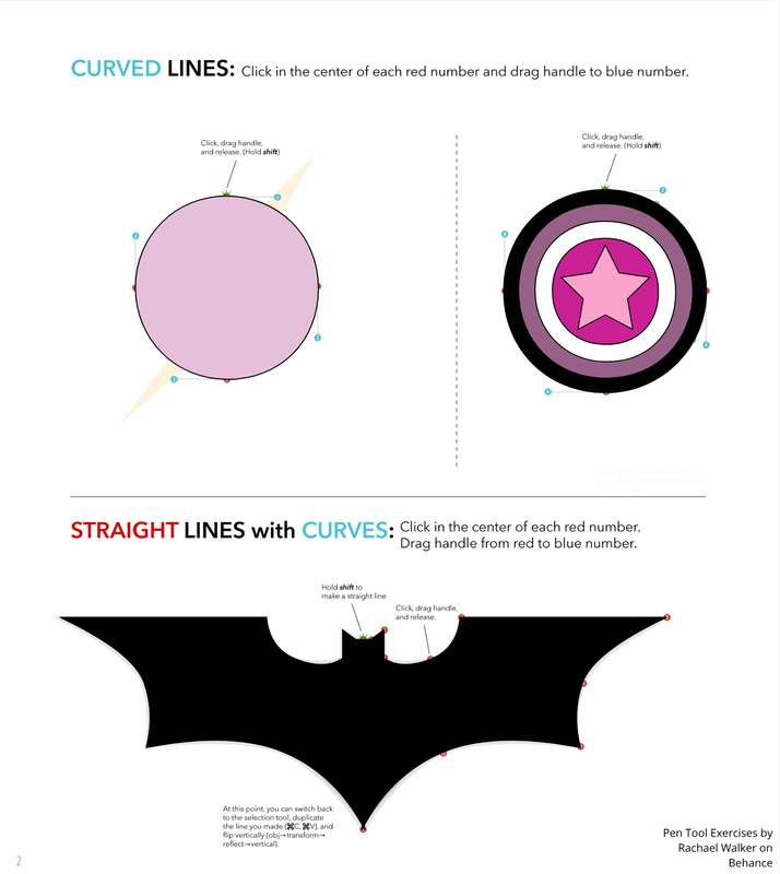
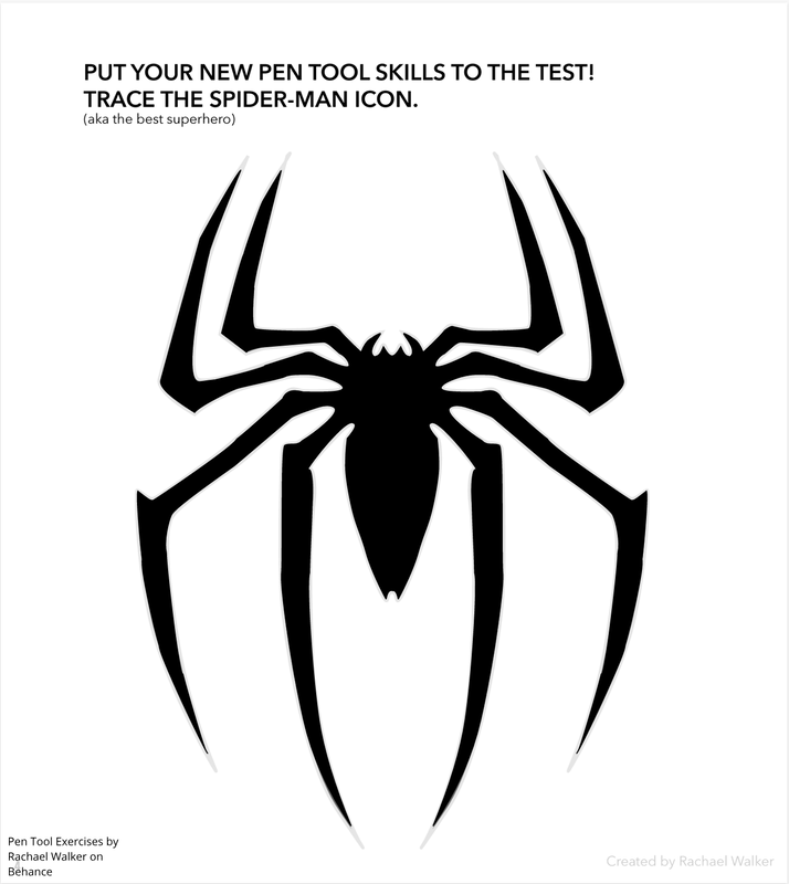
In class, we learned how to use the Pen Tool. We learned to make unique shapes and designs using the Pen Tool in the first three exercises (i.e. the superhero exercises), and we also learned how to cut shapes or clip shapes/things using the Pen Tool in the Penny exercise. In that exercise, we cut out the face of Abraham from the coin and clipped the image so that it was just Abraham's head. The Pen Tool is a well, a tool that allows people to create many varying shapes. And also allows them to clip images by drawing another shape over the image and clipping it. My final illustration/image is the product of a weird conversation I had with an online friend where we were discussing our lust for hot chocolate and watermelons and admiration for penguins. And that's how this monstrosity was brought to life. I replaced the marshmallows that should be in the hot chocolate with watermelons. Then, I placed a penguin to just chill in the hot chocolate, and added two extras since I thought the image looked too one-sidedly detailed. Some challenges I faced with this project was that for a very long time, no matter where I put the chilling penguin, it just didn't look right. I overcame this annoyance by just cutting off the legs to actually make the penguin seem like its in the hot chocolate instead of just, standing on its surface.
0 Comments
For this project, we were asked to create a logo for our imaginary brand. And that's what I did. I created a cat wearing shades which my imaginary company would produce. The tools I used in Gravit were the Pen tool, ellipses, rectangles, and that's about it. I first made the glasses with the ellipses and the pen tool. After I was done created the glasses and deciding its color, I tried to make a cat. However, after over 30 minutes of trying, I just gave up and went with blob cat and just made the cat one solid color instead of trying to add shadows. Well the most challenging thing about this process was making a proper cat, which I gave up on. So the second most hardest thing was creating the frames of the sunglasses. It looked really off to me at first, and still does. So do the shadows. I kind of fixed this by making the shadow a different color and doing some adjustments using the Pen tool. 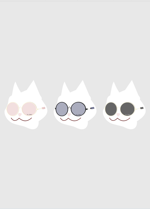 The name of my brand is Tini Shades. The purpose of my brand is to advertise sunglasses made by the company, then have them modeled by cats. That would be what the brand would be well known. This logo represents the brand very well. It displays one of its designs on the market, with a "cat" modeling for it. This logo is my favorite because pink or the red theme is a template I used for the other elements of my logo like the cat's nose and mouth. So, I thought that the pink shades went really well with the rest of the logo. Also, I would like to mention that I gave up on creating a proper cat so I just made a blob cat and said, yes. And that's about it. 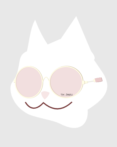 So for this summative, we were asked to do two mini assignments called "Color Names" and "Color Schemes." In Color Names, we were asked to show 15 different color's HEX and RGB codes. So basically, we had to find 15 colors and give their HEX and RGB codes. So knowing this, I made 15 circles and put them in columns of five. Each column had different color themes. And at the top of the column, I would make the color be bright enough where you could still tell what color theme it is and as you go lower, the circles' colors also get darker. So basically a gradient. After that we had to align everything and make the assignment look presentable. And I really do like how it turned out, the colors are pretty. As for Color Schemes, we were tasked with choosing colors for 4 different color schemes. Monochromatic, analogous, complementary, and triadic. We were also supposed to make the color schemes on the Adobe Color website. I saw some pretty good examples and I decided, since I was pretty basic for my first assignment I'll put in "some" extra work for this one. And I did, the idea of soft serve ice cream randomly came to me since I was hungry at the time. For context, this class is before lunch. So, now that I was set on tracing soft serve ice cream for this project, I found an image of soft serve ice cream on the internet. Color Names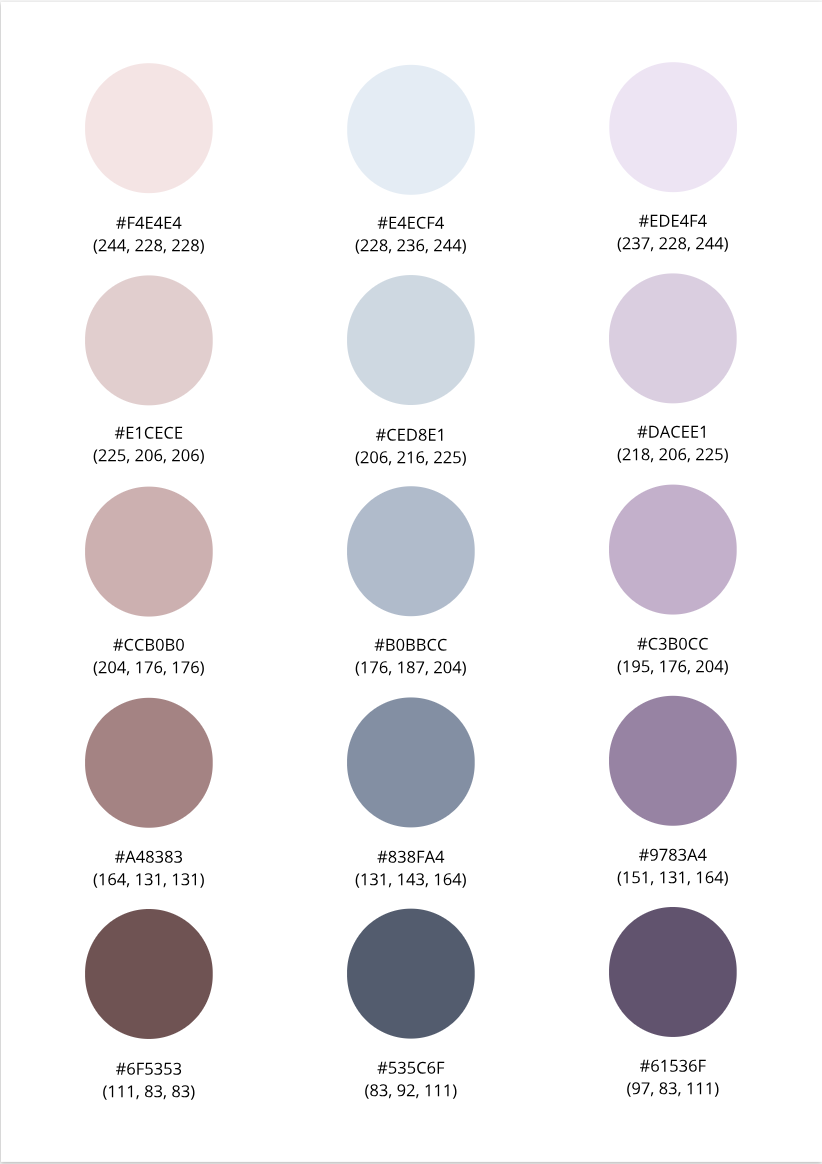 Color Schemes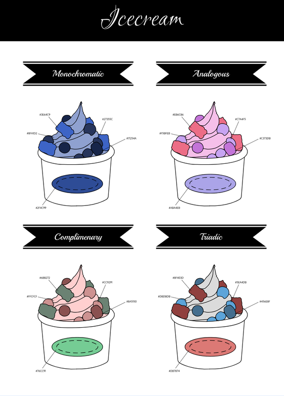 What I learned about Typography To start off, what even is Typography? Well, Typography is the visual component of the written word. (M. Butterick) And another thing, why is Typography even important? Can't we just make everything black and white? Well, you see, these days, people will buy products based on their visual design. For example, most people are more inclined to buy a book cover they find interesting over a book cover that's just dull and plain. Even if the contents of the plain book could be the most interesting story out there, in the end, the consumer won't pick it up if they don't find the first impression of the product interesting. And because of this reason, Typography is important! There's a quote out there that reads, "Each font has a personality and purpose." This is completely true. For example, this standard font I'm using to type this paragraph looks more formal, whereas a font like Comic Sans looks more goofy and gives off a comic-y vibe. Which means, this font has the purpose of writing like, long formal essays, whereas Comic Sans should probably be used in short texts in comics or something goofy like that. Furthermore, there's five different types of fonts. The Serif, Sans Serif, Monochrome, Script/Handwritten, and Display fonts. Serif fonts have "feet." They're typically used in large blocks of texts, plus they're also used as text on a print. Next there's Sans Serif. In contrast to the Serif font, Sans Serif doesn't have these "feet." This type of font is great for headlines, titles, and smaller chunks of texts in general. They're typically used on the internet/web. Monospaced fonts typically take up the same amount of space. Like for example, normally an I wouldn't take up the same amount of space as an M. However, a Monospaced I would create some feet in order to be the same size as a Monospaced M. Therefore, Monospaced fonts don't work well for large blocks of texts. Monospaced fonts are most commonly used in coding, actually. Next up, there's Script/Handwritten fonts. It appears cursive, calligraphic, or handwritten. It's sometimes difficult to read like most cursive (in my opinion). This type of font is good for logos, large headlines, and details. Finally, Detail fonts. They're good at getting attention, which means you should use this font sparingly. Having weird funky fonts forced in your face is annoying to the consumer, after all. For example, the display font can be used as a Children's book title. Typeface ComparisonIn the Typeface Comparison activity, we were asked to think of a word or phrase, then we're supposed to type that text in the five different types of fonts, Sans Serif, Serif, Monospaced, Script/Handwritten, and Display. We were tasked to surf the net or scroll through the fonts available in Gravit to find the five different types of fonts for our texts. After we settle on the five different fonts we're going to use on our texts, we have to note it down somewhere the type of font it is, and what the name of the corresponding font used. And we repeated this five times. After that, we made our work look, *ahem* pretty. And that was basically what I did for the whole activity. 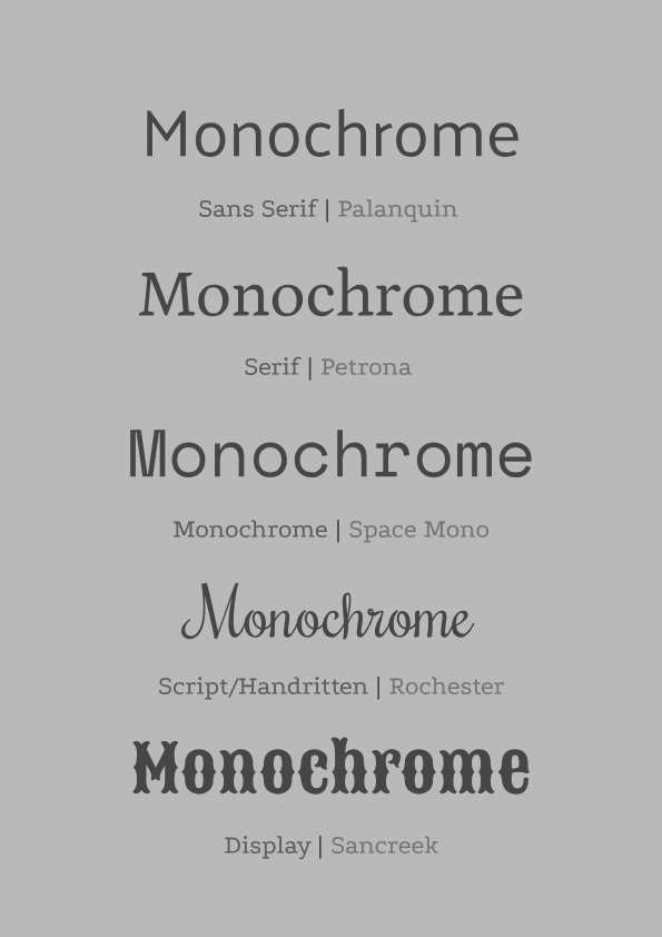 Word PortraitIn this activity, "Word Portrait," we had to use ten different type of fonts, and think of a word that you think matches the font's vibe/personality and one that doesn't. After that, you had to list the fonts that were used. Then just make it look aesthetically pleasing, like the last activity. Which is exactly what I did. I found ten fonts, thought of a word that I thought matched its vibe and one that doesn't. Then, I made it look aesthetically pleasing to my eyes. I still think the list of fonts looks bad.. But whatever. 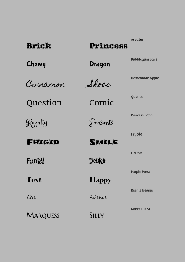 Why this is meaningful, atleast to me.Well, this "piece of art" is meaningful to me not as a whole but, because of the many different elements that makes up this "piece of art." For example, I like the red palette so that's why this whole piece is based around a pink base with a bit of black to stand out in the light colors. Which goes to the next element that's meaningful to me, the black cats. To get this out of the way, my favorite color is black alongside red, I just think it goes with everything. And cats, they're my favorite type of animal. They're cute, mind their own business and aren't energetic all the time like a lot of dog breeds I know. So, I combined those things to make a black cat, even though I like the cats with snow white fur. Anyways, moving on. Strawberries are one of my favorite fruits, probably in my top 3. Also, may I mention that my favorite "snack" to munch on is bread. Although it's not good for my skin so I had to stop.. And that's why the cat says nothing but stare at the food longingly, however inside its fuming that it can't eat this yummy looking snack. Oh and I just added the strawberry jam there because whenever I look at the Pinterest toasts, most have jam that makes it look ten times yummier. And finally, the plaid handkerchief is just there because I thought it added more flavor to the whole piece. To summarize this design, the black cat represents me, who constantly wishes to eat something sweet and silently fuming whenever I saw something that looked good, and this whole thing is portrayed in a red theme. 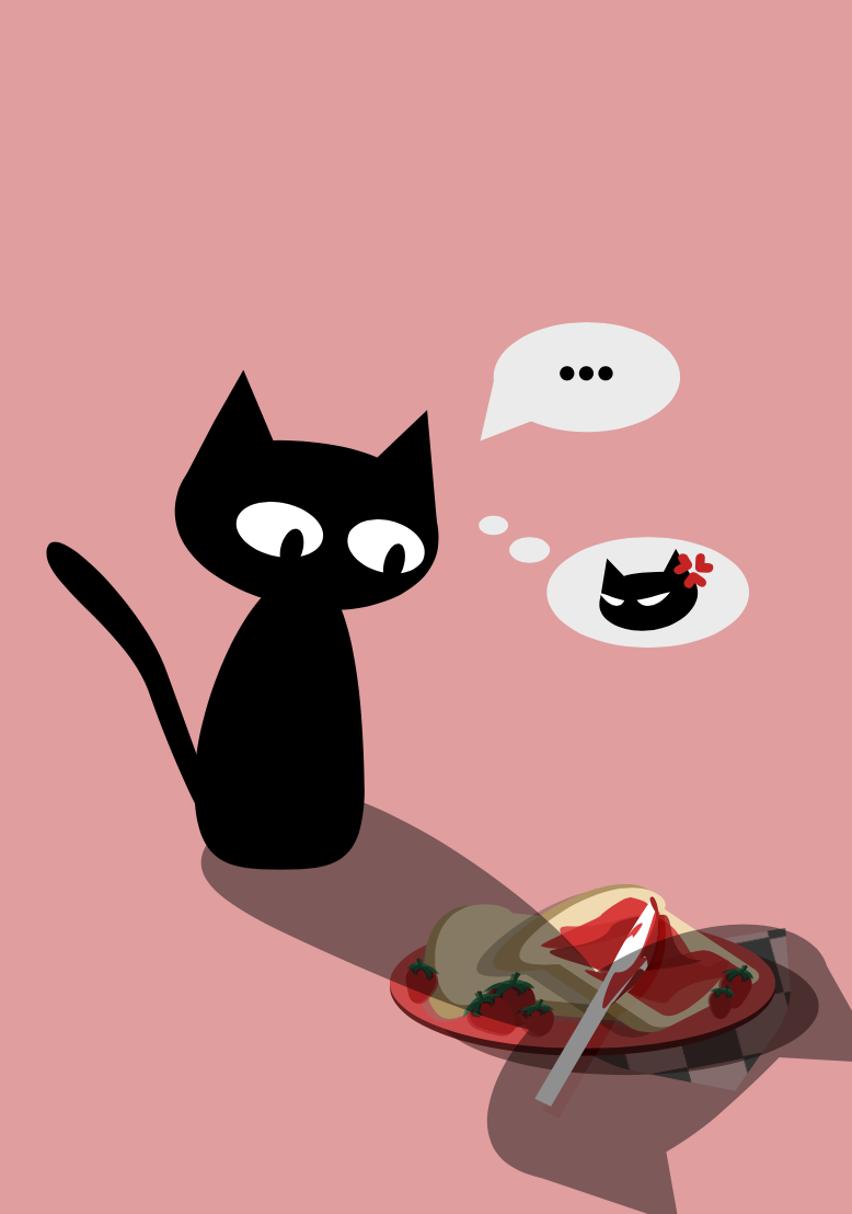 Some things I learned.Today, I learned how to modify a shape's appearance. I also learned how to compound said shapes in four different ways, which the four ways to compound a shape are union, subtract, intersect, and difference. Overall, a pretty chill lesson before the final project in my opinion, I'm looking forward to how I'll incorporate this lesson into my final project! 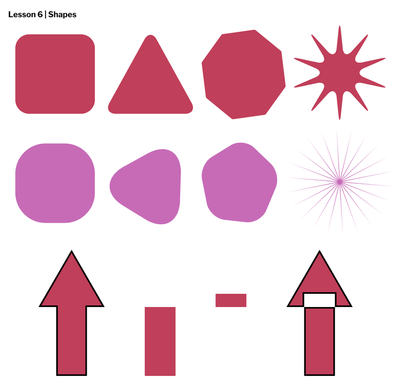 Some things I learned.Today, I learned what layers are, how to group elements together, and to ungroup them as well. I also learned and played around with alignment options in Gravit. Then, I took everything I learned and created this black circle chain with blue highlights at the bottom. I'd say this was also another pretty good and relaxing lesson as any other. 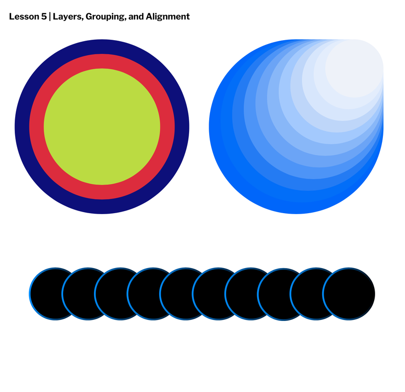 Some things I learned.Today, I learned how what fill and borders actually are in graphic design/vector design. I learned how to fill in shapes, and I also learned how to give them borders. I also messed around with the corners of the shapes, and the borders too. I also learned what opacity/transparency is. And all in all, this was yet again another aesthetically pleasing use of my time. 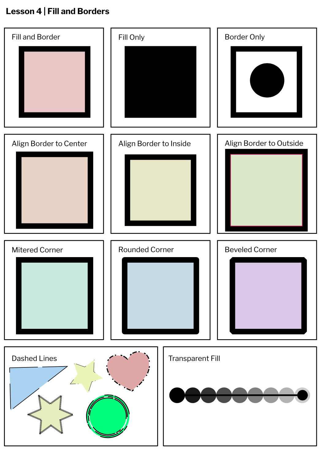 Some things I learnedToday, I learned the difference between the Pointer and the Subselect tool in Gravit. And, I learned their uses and how to use them. I'd say my experience in doing so was pretty relaxing. Also, modifying a shape's anchor points with the Subselect tool is actually very satisfying and I actually spent more time than I thought I would modifying the anchor points until I actually found something I was ok with. All in all, very satisfying lesson. 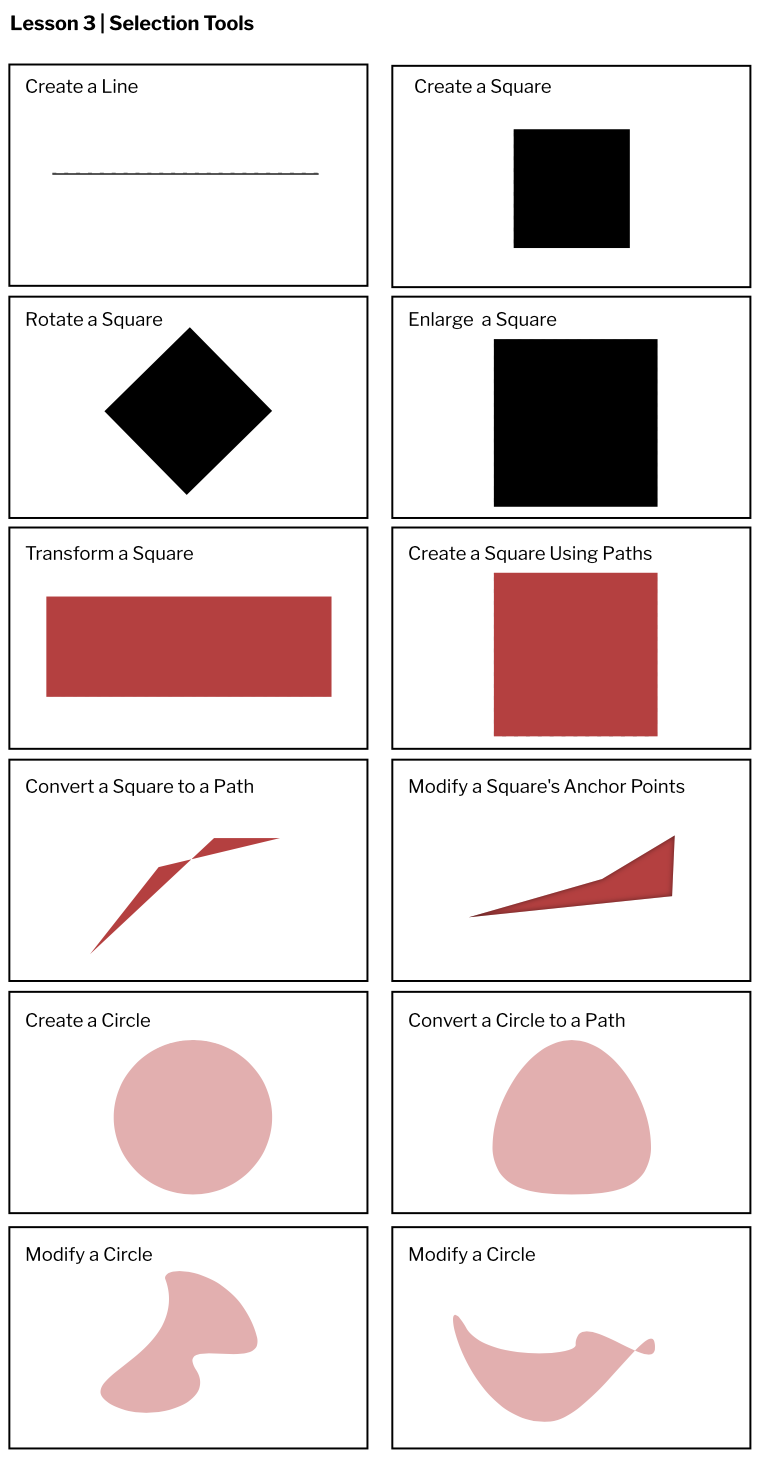 Some things I learned.One thing I learned while catching up on work was, making graphic design is actually really satisfying. Like, making boxes or squares in different shades of red, my favorite color actually. AND having all these texts in the center and sort of spaced apart evenly, just- It's just that I think the end product can be such eye candy, since its so aesthetically pleasing. Atleast for me. Plus, I also learned the inner workings of Gravit the site. All in all, I had a fun time.  |
AuthorHi I'm Tiny the average height person. She/Her. I like reading and I sooo love reading in the dark amiright? Listen to more sarcastic thoughts on my About me page! Archives
March 2021
Categories
All
 This work is licensed under a Creative Commons Attribution-NonCommercial-NoDerivatives 4.0 International License. |
 RSS Feed
