A Tired Person's Bloghi please leave
|

I'm just going to place this sociopath here out of context :)
|
What I learned about Typography To start off, what even is Typography? Well, Typography is the visual component of the written word. (M. Butterick) And another thing, why is Typography even important? Can't we just make everything black and white? Well, you see, these days, people will buy products based on their visual design. For example, most people are more inclined to buy a book cover they find interesting over a book cover that's just dull and plain. Even if the contents of the plain book could be the most interesting story out there, in the end, the consumer won't pick it up if they don't find the first impression of the product interesting. And because of this reason, Typography is important! There's a quote out there that reads, "Each font has a personality and purpose." This is completely true. For example, this standard font I'm using to type this paragraph looks more formal, whereas a font like Comic Sans looks more goofy and gives off a comic-y vibe. Which means, this font has the purpose of writing like, long formal essays, whereas Comic Sans should probably be used in short texts in comics or something goofy like that. Furthermore, there's five different types of fonts. The Serif, Sans Serif, Monochrome, Script/Handwritten, and Display fonts. Serif fonts have "feet." They're typically used in large blocks of texts, plus they're also used as text on a print. Next there's Sans Serif. In contrast to the Serif font, Sans Serif doesn't have these "feet." This type of font is great for headlines, titles, and smaller chunks of texts in general. They're typically used on the internet/web. Monospaced fonts typically take up the same amount of space. Like for example, normally an I wouldn't take up the same amount of space as an M. However, a Monospaced I would create some feet in order to be the same size as a Monospaced M. Therefore, Monospaced fonts don't work well for large blocks of texts. Monospaced fonts are most commonly used in coding, actually. Next up, there's Script/Handwritten fonts. It appears cursive, calligraphic, or handwritten. It's sometimes difficult to read like most cursive (in my opinion). This type of font is good for logos, large headlines, and details. Finally, Detail fonts. They're good at getting attention, which means you should use this font sparingly. Having weird funky fonts forced in your face is annoying to the consumer, after all. For example, the display font can be used as a Children's book title. Typeface ComparisonIn the Typeface Comparison activity, we were asked to think of a word or phrase, then we're supposed to type that text in the five different types of fonts, Sans Serif, Serif, Monospaced, Script/Handwritten, and Display. We were tasked to surf the net or scroll through the fonts available in Gravit to find the five different types of fonts for our texts. After we settle on the five different fonts we're going to use on our texts, we have to note it down somewhere the type of font it is, and what the name of the corresponding font used. And we repeated this five times. After that, we made our work look, *ahem* pretty. And that was basically what I did for the whole activity. 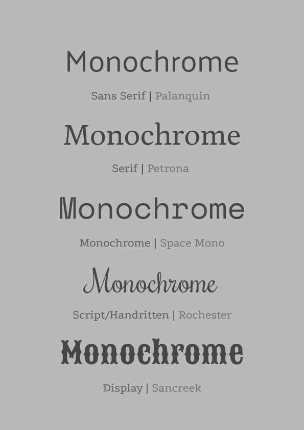 Word PortraitIn this activity, "Word Portrait," we had to use ten different type of fonts, and think of a word that you think matches the font's vibe/personality and one that doesn't. After that, you had to list the fonts that were used. Then just make it look aesthetically pleasing, like the last activity. Which is exactly what I did. I found ten fonts, thought of a word that I thought matched its vibe and one that doesn't. Then, I made it look aesthetically pleasing to my eyes. I still think the list of fonts looks bad.. But whatever. 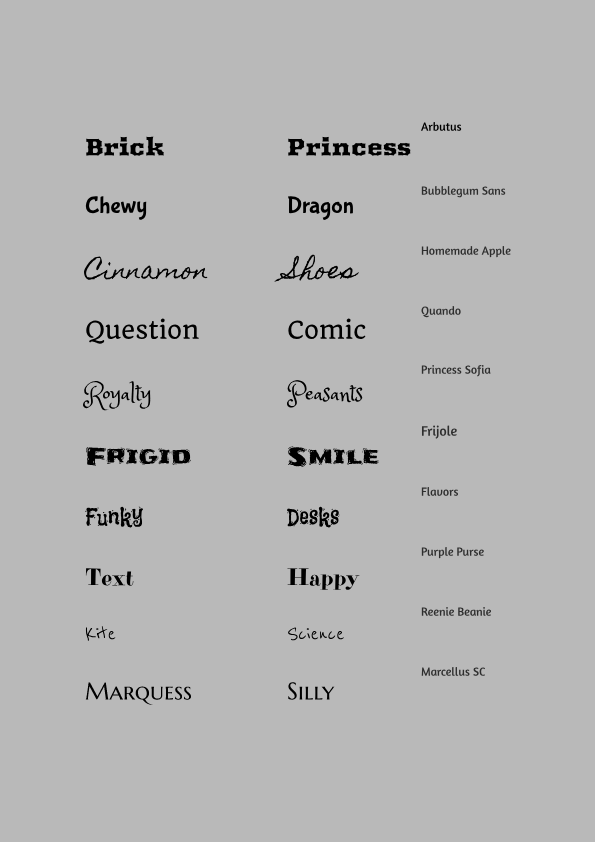
0 Comments
Leave a Reply. |
AuthorHi I'm Tiny the average height person. She/Her. I like reading and I sooo love reading in the dark amiright? Listen to more sarcastic thoughts on my About me page! Archives
March 2021
Categories
All
 This work is licensed under a Creative Commons Attribution-NonCommercial-NoDerivatives 4.0 International License. |
 RSS Feed
